Monday, September 10, 2012

A Year Later...Decore Scrubbed Clean

One year ago this week our home was damaged by water. Basically, the year was divided into three phases:  negotiation, reconstruction, and redesign.  The most nerve-wracking phase was the five months of negotiating with the plumber's liability insurance company before they agreed to pay for the itemized and verified damages.

What a happy day in February, when we could actually begin reconstruction.  The rebuild took four months.  Ceilings, walls, and flooring were demolished, then replaced to provide fresh perimeters.

With a blank slate, I began a redesign.  First, I decided my rooms had been smothered.  Walls and surfaces cried out for breathing space.  So, I edited furniture and accessories ruthlessly.  We threw away, gave away, and sold the extraneous. I also took this opportunity to update my color schemes.

Finally, in mid-May, we moved back in.  Over the summer, we have continued to replace damaged furnishings and have added a few bits of modern to bring the house into the twenty-first century. Now on the anniversary of the flood, all three floors of our home have been given a facelift.

Would you like a tour?  I always like the before and after postings on other design blogs, so I'm hoping you do too. Here is an overview of some of the main rooms.  This will be followed in future posts by a more detailed room-by-room examination.

The dining room lost its lovely Gracie hand painted wallpaper.  I was sad to see it go, but the moisture in the house finished lifting the already compromised paper from the walls. Before the room was a soft yellow with pink, blue, and green accents.

Now, neutral grasscloth adds texture to the walls.  The formal swags and panels were replaced by sheer Lee Jofa fabric with trapunto medallions giving a more youthful,  casual, and updated look to the room.

The kitchen went from raspberry

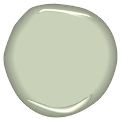
to a grayed blue-green Benjamin Moore paint color called "picnic basket" (50%). My husband confessed after it was repainted that he was never a fan of the pink! :)


The adjoining sunroom went from yellow


to a kitchen companion blue/green grasscoth.


And the living room went from green

to neutral.

With the pain is behind us, I am actually thankful for this opportunity to freshen up a seventeen-year-old home.  How appropriate; our home is as fresh as a landscape after a rain.

Saturday, March 24, 2012

Poaching Design Secrets

I've never stolen so much as a wash cloth from a hotel, but I'm not past sneaking some design ideas into my mental valise.  I pocketed some tips last week, when Bill and I were in Miami for a medical conference.  We stayed at the Fontainebleau, a renovated mid-century hotel which, six decades since its opening, is still quite avant garde. Let me share my booty, the hotel's age-defying design secrets.
Amazingly, this landmark is not a past-her-prime grande dame; rather, the post-war edifice is still a debonaire gentleman whose eloquence could grace current pages of GQ magazine!  From the lobby through the corridors, to the guest rooms, and out to the ocean and pool-side oases, it is obvious:  the Fontainebleau has found the fountain of youth.

Just inside the front door, I was able to ferret out some design tips.  Take, for example, the gentleman's signature black marble bow-ties on the lobby floor; would you guess they are original, laid in the 1950's? Idea to steal:  classic white and black marble never goes out of style.

Then, the lighting in the lobby is noteworthy for its age-defying glow.  Each of the three enormous chandeliers reportedly cost a million dollars.


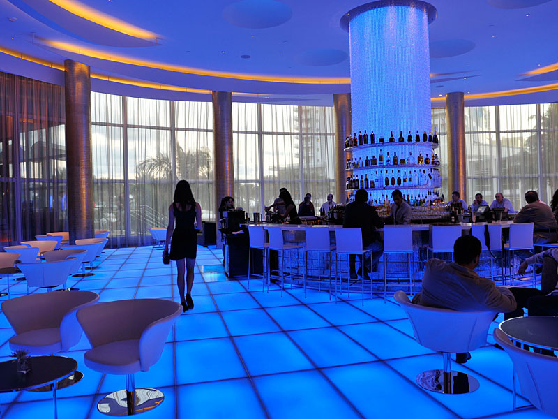
At the back of the lobby, the bar's blue lights are forever young.
This hip luminescent blue is repeated in LED screens behind the concierge desk.  Who says seniors aren't with-it?


Here's the design truism from the lobby: Lighting can produce an amazing face-lift!

Leaving the lobby, guests ride Art-Deco elevators to their floor.  The doors open to vestibules also decked out in up-to-the-minute style.

Look at the gorgeous silver and blue striped wallpaper.  The horizontal stripes are trendy, but the soft colors are classic.

Along the corridors, blown glass fixtures dot the ceiling in military precision.  They are unique, reminding me of mini-Chihuly installations. (If you aren't familiar with America's living national treasure, Dale Chihuly, the world renown glassblower, go to:  http://www.chihuly.com.)

Idea to steal:  Details, such as light fixtures, matter.  Their color and form should match the overall design.

Once guests have located their room, they enter their own private upscale retreat.  Our room was an example of the Fontainebleau's up-to-the-minute design--a neutral backdrop with color in small splashes.
The headboard was faux-leather, an off-white tone.  In spite of the nondescript color, it had a presence, because of its height and gridded texture. Take aways: Tall headboards are quite in vogue, and texture prevents neutral-boredom!  The lamps, presumably to accommodate the headboard height, were gargantuan. Note to self:  Keep proportions in mind when choosing lamps. Finally, notice the restrained use of color.  The aqua throw and aqua/lime green pillows added zest, but can be changed out to accommodate the color trend of tomorrow, without a complete facelift.

Then, too, notice the guest bathroom.  It was gorgeous. Oversized, Carrerra marble, subway tiles covered the walls from floor to ceiling, while the flooring was 10 X10 inch marble squares. Using the two shapes was a clever way to defy age-detection.

But, the coolest feature was the frosted glass door leading to the commode cubicle.  The three-quarters of-an-inch-thick translucent glass allows light into the space, so you don't feel claustrophobic in the tiny privacy closet. I dare say this is an idea whose time has come and will become classic.
Another enduring feature of the hotel is the outdoor decor.  The Fontainebleau, when it opened in 1954,  boasted 250 cabanas around the 6,500 square foot pool. And here we thought outdoor rooms were our idea.  Not so, the senior statesman offered his guests these opulent oases as respite from the Miami heat from day one. Since copying is the highest form of a compliment, I don't think the hotel would mind if we decked our own backyards in white sail-cloth, installed a flat-screen tv, and laid out oversized cushions.
All other design tips aside, the singular feature of the hotel which never ages is the view!


Decorators can't put the Creator's amazing seascape in their suitcase, but they can take away mental images of his amazing sense of color, texture, and form.

(Photos, other than those marked, are from the Fontainebleau's website or ones I took myself.)

Sunday, February 26, 2012

Tablescape: A Twist on Tradition

I thought you might enjoy seeing a tablescape designed by my daughter, Anna.  She has a unique flare for combining traditional with modern designs.  


The eclectic candlesticks in this arrangement are a perfect example.  The two large brass candlesticks are antiques--made from a traditional material in a classic form.

However, the matte black candlesticks, although traditional in form, are fabricated of an unexpected material--bisque.

Made by Klein Reid

Then Anna added a third type of candlesticks--miniature, midcentury brass candlesticks by Danish master designer Jens Quistgaard (1919-2008), for Dansk Designs.    

But the most unusual elements in Anna's tablescape are the three foldable stars.  In 1965, John Kosticks made these models as examples of mathematical concepts. He describes them as "mathematical truths you can hold in your hand." Kosticks fabricates the bronze stars in Massachusetts.  Much to his delight, they were chosen this year by Elle Decor as one of their favorite gift ideas for the holidays.  


I could never have conjured up this arrangement, but it is captivating!  Well done, Anna!

Friday, January 27, 2012

Face the Sunshine

Dark, dank January days remind me yearly of why I love light-filled houses. Just as chlorophyll absorbs sunlight and uses its energy, so the human spirit is charged by light. This is why, when I look for a place to live, at the top of my wish list is a southern exposure. It is also why the kitchen and sunroom are the two brightest, most cheerful rooms in our home; they are banked with south-facing windows.

To reinforce the sunny spirit of these two rooms, I have chosen white and budding green as their new palette. In the sunroom, white linen with a variegated green embroidered scroll will bracket the side of the windows without obstructing one inch of light.

KravetCouture--Linen Scroll:  Jade

The wall color, 50% of Benjamin Moore Color Stories CSP-790, budding green, not only picks up the secondary color found in the entrance wallpaper, it also harmonizes with the lush greens found in our Haitian landscape paintings.

Because our sunroom is our "Haiti" room, it is filled with West Indies colonial furniture which will be reupholstered in creamy white linen.  However, the "piece de resistance" will be a shadow box full of green sea urchins.  
Patrick Sutton Home
Adjacent to the sunroom is my predominately white kitchen.  Really, it is an extension of the sunroom, so I have carried the white and green theme into this room as well.  The white cabinetry is at eye level, so it is  primary.  However, the wall space above the cabinets will be painted Benjamin Moore CSP 760, oil cloth, a slate green color.


The three extraordinarily tall double-hung kitchen windows are topped by transoms.

They will be softened by a relaxed shade, held up with ribbon to keep it from blocking the light. For the shade, I have chosen a lovely white batiste with a slate-colored embroidery running through it.
Lee Jofa Fabric--Threads--Silver Birch  
I can't wait to read once again in my sunroom and cook in my kitchen! Finally, this week, we received the insurance company check, signed with a builder, and were given a tentative construction schedule which marked the end of May or the beginning of June to re-occupy. Knowing how building projects can be delayed, I am thinking the end of June or July 4th as the re-entry date.  I am anxious to get back into our home, so I can follow Helen Keller's wise advise: "Keep your face to the sunshine, and you will never see the shadow."

Friday, January 20, 2012

Silver Lining: I Can Redecorate

Dorothy Draper, who in 1923 established the first interior design company in the United States, also wrote the first design book, Decorating is Fun! 

This prima donna of design was right! Just this week, nineteen weeks post-disaster, we finally reached a settlement with the insurance company. With this nightmare behind us, I can begin the enjoyable process of choosing colors, fabrics, flooring...

Where does one start when furniture was not damaged, but flooring, ceilings, and walls were? My goal is to update, so I decided to begin with a monochromatic palette.

A lovely Tabriz carpet with a raspberry field had been foundational to my home's color scheme.   Unfortunately, with all the standing water in the living room, the natural dyes ran, rendering the rug a complete loss.  We found a neutral Tibetan rug with just touches of celadon to replace the Tabriz. Without the raspberry, celadon and a neutral cream became the colorway.
Long before the deluge, I had ordered upholstery fabric in ivory, the pillow color, for the sofa.  The flood just gave me another incentive to update this classic piece.


To further eliminate the pink, I had an expert seamstress remake the silk Brunschwig &  Fils draperies, tucking the raspberry stripes in seams, leaving the variegated green stripes and neutrals visible.

 I also plan to lose the topper for a more contemporary look.

When we move back in, the raspberry throw will go; the celadon French daybed and two library chairs will stay.
Mohair at top is on the daybed; the cut velvet on the bottom on the library chairs.
Two other French bergere chairs in the room will be covered in a neutral silk fabric.


Removing the raspberry also dictates replacing the Schumacher raspberry striped wallpaper in the entrance.


Even though it was not damaged in the flood, we decided we will cover the cost of a neutral Stroheim grasscloth with a very subtle celadon damask glaze.


The dining room opens on the opposite side of the foyer from the living room, so a complimentary color scheme makes sense here, too. As it turned out, removing the hand-painted, silk Gracie wallpaper in the dining room was not debatable.  The extreme humidity in the house after the flood finished lifting off sections of the paper. In its place, I have chosen a companion to the entranceway paper, a Stroheim plain Saipan sisal.

To neutralize this room,  I plan to hang simple sheer drapes using Lee Jofa Phoebe cream fabric with trapunto embroidery in the same color of tan.

(The computer screen distorts many of these colors., but in person they all flow.)
For sixteen years, I have enjoyed the vivid colors in my home, but now I am ready to embrace change. Getting to redecorate is the silver lining behind our water-filled cloud. The sun has come out, so let the fun begin!

Tuesday, December 6, 2011

Home Sweet Hotel Suite

My husband and I have been living in an extended stay unit at The Inn at Leola Village, since our home was deluged three months ago. This charming conglomeration of refurbished cottages and new buildings isn't home, but it is a palace compared to refugee and natural disaster tents.  In a global context, we are blessed.

Even by American standards, the Inn at Leola is a charming, quiet place to stay; it deserves its four stars.  From the front desk receptionist, to the breakfast servers, to the cleaning staff, every employee is professional, courteous, and efficient. The rooms are well-appointed and the grounds lovely.


But beyond the nice surroundings, we are blessed by the very reason we are here--a damaged home.  Let me explain.  This week an article in The Wall Street Journal by Andrea Petersen ("When Home is Where the Hotel Is") listed causes for the increase in long-term stay units. The article made us count our blessings.
STAY
 Allison V. Smith for The Wall Street Journal
As Petersen noted, the slow real-estate market has contributed to families opting for temporary housing.  We can be thankful we are not waiting for a home to sell in a depressed market.  Nor are we in an extended stay unit because our marriage is dissolving.  Thankfully, we are not here because a family member is seeking medical treatment, nor are we jobless.  Furthermore, we are blessed even in a local context.  Some Lancastrians are homeless, but uninsured. At least, our damage was caused by a contractor with liability insurance.  Indeed, we have many reasons to be thankful.

However, lest I sound too much like Pollyanna, true confession: I get very perturbed by the insurance company's lethargy.


Donegal Building 

When I get frustrated, I try to list the positives of our situation:

First, this unexpected dislodgment has provided a respite from daily chores--cleaning and cooking.

graphicshunt.com

Second, staying in a two-room efficiency demonstrates how little we actually need. Living with less is freeing.
akingslife.com
Third, when what you have is taken away, you are more appreciative of what you have.


Fourth, freedom from the mundane makes one focus on people--not on things.


And fifth, our homelessness has made me appreciate what Jesus gave up for us.  He did not have a place to lay his head during his stay on earth.  Why would he leave the splendor of heaven to be born in a stable, live as an itinerant, even be buried in a borrowed tomb?  To prove his love for us, which is the biggest cause for a thankful heart this Christmas season.

Won't you join me in thanking the Lord for his gift, no matter your circumstances.