Wednesday, November 14, 2012

Anchors: A Weight Grounds a Room

"Every room needs an anchor."  This is a truism in design.  Just as an anchor keeps a boat from being carried off by the tide, so too, a heavy, dark or tall piece of furniture grounds a room.

Below are some examples of room anchors in our home.

In the dining room, the corner cupboard grounds the room.

In most kitchens the stove with hood are the visual weight. Is this true in my kitchen? What about the large Subzero refrigerator?  Because of the hood over the range does not continue to the ceiling, it is a bit morphed by the frig.  I'd vote for the frig as the anchor in this room.

In our sunroom, the bird prints which fill the main wall act as the focal point. Individually, they aren't large or dark, but when hung as a set of six, they definitely command the room.

Our living room is an interesting example of the "anchor" design principle with several heavy pieces of furniture and a fireplace. I wonder what you would say is the weight? Look at the room from a couple of angles, before you vote.
Actually, I waffle on this. The tall bookcase has the greatest height and visual weight.
However, it is counter-balanced by the bulk of the black piano on one side and by the fireplace and grandfather clock on another corner.  I could never figure out why this room arrangement works, but as I analyze it, I believe the three large pieces form a balanced triangle.  So, maybe there isn't one anchor in this situation, but three.

The library, too, has more than one large, dark element, but the bookcase/fireplace wall wins hands down as the anchor, because the other bookcase has no where near the heft.


Now, let's inspect the bedrooms.  Our main floor master bedroom has a tall piece of furniture opposite the bed.  However, the volume of the bed makes it the anchor, rather than the armoir.

master bedroom
The same is true for the uptstairs bedrooms. 


upstairs bedrooms
And the lower level guest room follows the same rule.
lower level bedroom
Finally, in the family room a stone wall with fireplace is the room's focal point and weight.
The single anchor-less room in our home is the exercise room.  The heavy equipment floats in the room without any heavy or dark or weighty piece.  Do you have a suggestion for changing this dynamic?
Design principles often have parallels in life.  What is the focus or anchor in my life?  How I spend my time and money reveal what I weigh as important.  If my time and money usage don't reflect what I want to be the most important things in my life, maybe I should make some changes.


Wednesday, November 7, 2012

Bless This House

Thankfully, our home was not damaged by this year's convergence of the hurricane, Sandy, and the Nor'easter.  However, my heart goes out to those who were not spared.  Recovering from water damage is overwhelming, as we found out last year.

Viewing images of the devastation on the New Jersey shore led me to ponder a prayer I  prayed as a child.  Maybe you said it, too.  "Bless this house, Oh Lord, we pray; make it safe by night and day."


I am sure many of the east coast home owners prayed for protection from the hurricane, but the storm destroyed their homes in spite of their prayers. Why?  In this world, storms are a fact of life. We don't always have an answer as to why some are hit and others spared.

However, truth-be-told, most often our houses are safe, not destroyed. Catastrophes are not the rule, but the exception.
When we are safe and warm, we need to be thankful and not take for granted our protection.

A fellow blogger posted a prayer from the Lutheran prayer book to help us verbalize this thanksgiving:

"Lord God, our home is among the most precious gifts we receive in this life...Make us ever grateful for this shelter from life's storms...According to Your will, protect this home from the spiritual assaults of Satan, but likewise make our home a fortress against the calamities of nature and the wickedness of sinful man...May all who dwell in our home be blessed by Your presence and Your peace, and may all who go forth give thanks for the grace they received from You...We receive Your loving kindness in our home as a reminder of the eternal home we inherit through your Son, Jesus Christ, in whose name we pray. Amen."

Such modeled prayers are helpful in prompting me to be specifically thankful.  They remind me of what could seem ordinary.  Consequently, I have consciously placed pictures and plaques around our home as prompts to praise God for his love and protection.

In my office hangs a picture of the dove that Noah let out of the ark after the rain stopped.  The caption beneath the print reads:  "And the Lord did not forget."  What a wonderful reminder of God's unfailing faithfulness, even after a deluge!

A plaque on my kitchen counter also makes me aware of the Lord's supremacy over the lives lived in these four walls.  My in-laws purchased the original plaque in Haiti many years ago and graciously had a copy made for us.  Translated from French it reads:  "The Lord is the chief of this house, the unseen host present at every meal, and the silent auditor of every conversation."
Yet another reminder to be aware of and thankful for God's provision is found above my stove.  The words, "Give us this day our daily bread" are cross-stitched cues that every meal is a gift from God, not to be expected, but to be acknowledged with thanksgiving.

Then in one daughter's room is a Pat Buxley Moss picture of a little girl praying.  Hopefully, this reminds whoever is passing by to give thanks in all circumstances.

In the other daughter's suite hangs a print illustrating the tender care of the Good Shepherd.
Finally, there is a cross-stitched Scriptural quotation, "God's love endures forever", to remind us that even when storms hit our homes his love is present and active.


Monday, October 15, 2012

China on Dining Room Walls

Trying to find appropriate, but not over-used, dining room wall decor can be a challenge. I wanted something unique to fit within the perimeters of our room.  I finally settled on mounting china on the walls, but not in the form you might expect.

 On one wall in the room, we have a lovely family painting.  

But across the room, on either side of a corner cupboard I had two blank walls.

 I considered a mirror or an arrangement of plates.  Both struck me as too predictable. What to do?  Once I had drapes made for the room, the fabric became a starting point for my creativity.


I remembered in Baltimore seeing a graphic shadow box display at Patrick Sutton Home.

That amazing collection of sea urchins in the shadow box was unforgettable.  But, hmm....dead sea creatures?  That didn't sound very appetizing for a dining room.  What could I substitute?

Then I remembered the white porcelain flowers my daughters had given me for Mother's Day.


They are the perfect size and are fabricated of a matte china. How perfect is that?!


My next problem was finding a large quantity of the porcelain. A call to the shop where my daughters had purchased my Mother's Day gift only yielded a few flowers--not enough. After much searching on the web, I located the china flower distributer on the West Coast.  (Now, I will admit that it took courage to pull the trigger on placing an order large enough for what I had in mind.  What if I didn't like the outcome? I was fairly certain the finished product would look good, so I took the plunge and ordered--fifty china blossoms!) 

When the flowers arrived, I visited several frame shops looking for just the right shadow box to compliment the frame already in the room.  

I chose a simple gold frame which also matches the chandelier in the room.


In discussing my idea with the owner of the frame shop (The Right Angle), she suggested using a thin white filet inside the frame to draw out the white flowers. Great idea!  It really makes the display cohesive.

Next, I took home several mat samples to hold up against the wall color.  The one I chose is a very soft pearl-toned silk mat, a subtle contrast to the white porcelain, while still allowing the flowers to stand out distinctly from the background. In addition, the silk mat's sheen provides a subtle contrast to the matte finish of the flowers.


Finally, I decided to have two shadow boxes made, because the corner cupboard cried out for something on each side.  (I am partial to balance.)


Well, what do you think of the final product?  Should I produce more china-in-a-shadow-box for marketing?

Monday, September 24, 2012

Dining In

Our home has several places suitable for eating.  Now that we are empty nesters, cozy spots for only two have been added to the "dining rooms."

Breakfast, when we take the time, is at the bar.  This pass-through between the kitchen and sunroom is ideal for a quick bite.  I love using different placemats depending on the season.


Lunch is sometimes at the zinc topped table between the kitchen and sunroom.  The placemats were a splurge I couldn't resist because the aqua and white polka dots matches my wallpaper perfectly!


True confessions:  Our evening meal is often eaten off trays in the library, so we can watch the evening news.  (Now doesn't that age us?)


In spite of all the little spaces, I must say that my greatest delight is having a table full in our dining room.

Ok, it's your turn for honesty-hour.  Where do you eat in your home?

Monday, September 10, 2012

A Year Later...Decore Scrubbed Clean

One year ago this week our home was damaged by water. Basically, the year was divided into three phases:  negotiation, reconstruction, and redesign.  The most nerve-wracking phase was the five months of negotiating with the plumber's liability insurance company before they agreed to pay for the itemized and verified damages.

What a happy day in February, when we could actually begin reconstruction.  The rebuild took four months.  Ceilings, walls, and flooring were demolished, then replaced to provide fresh perimeters.

With a blank slate, I began a redesign.  First, I decided my rooms had been smothered.  Walls and surfaces cried out for breathing space.  So, I edited furniture and accessories ruthlessly.  We threw away, gave away, and sold the extraneous. I also took this opportunity to update my color schemes.

Finally, in mid-May, we moved back in.  Over the summer, we have continued to replace damaged furnishings and have added a few bits of modern to bring the house into the twenty-first century. Now on the anniversary of the flood, all three floors of our home have been given a facelift.

Would you like a tour?  I always like the before and after postings on other design blogs, so I'm hoping you do too. Here is an overview of some of the main rooms.  This will be followed in future posts by a more detailed room-by-room examination.

The dining room lost its lovely Gracie hand painted wallpaper.  I was sad to see it go, but the moisture in the house finished lifting the already compromised paper from the walls. Before the room was a soft yellow with pink, blue, and green accents.

Now, neutral grasscloth adds texture to the walls.  The formal swags and panels were replaced by sheer Lee Jofa fabric with trapunto medallions giving a more youthful,  casual, and updated look to the room.

The kitchen went from raspberry

to a grayed blue-green Benjamin Moore paint color called "picnic basket" (50%). My husband confessed after it was repainted that he was never a fan of the pink! :)


The adjoining sunroom went from yellow


to a kitchen companion blue/green grasscoth.


And the living room went from green

to neutral.

With the pain is behind us, I am actually thankful for this opportunity to freshen up a seventeen-year-old home.  How appropriate; our home is as fresh as a landscape after a rain.

Saturday, March 24, 2012

Poaching Design Secrets

I've never stolen so much as a wash cloth from a hotel, but I'm not past sneaking some design ideas into my mental valise.  I pocketed some tips last week, when Bill and I were in Miami for a medical conference.  We stayed at the Fontainebleau, a renovated mid-century hotel which, six decades since its opening, is still quite avant garde. Let me share my booty, the hotel's age-defying design secrets.
Amazingly, this landmark is not a past-her-prime grande dame; rather, the post-war edifice is still a debonaire gentleman whose eloquence could grace current pages of GQ magazine!  From the lobby through the corridors, to the guest rooms, and out to the ocean and pool-side oases, it is obvious:  the Fontainebleau has found the fountain of youth.

Just inside the front door, I was able to ferret out some design tips.  Take, for example, the gentleman's signature black marble bow-ties on the lobby floor; would you guess they are original, laid in the 1950's? Idea to steal:  classic white and black marble never goes out of style.

Then, the lighting in the lobby is noteworthy for its age-defying glow.  Each of the three enormous chandeliers reportedly cost a million dollars.


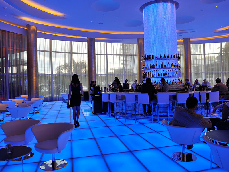
At the back of the lobby, the bar's blue lights are forever young.
This hip luminescent blue is repeated in LED screens behind the concierge desk.  Who says seniors aren't with-it?


Here's the design truism from the lobby: Lighting can produce an amazing face-lift!

Leaving the lobby, guests ride Art-Deco elevators to their floor.  The doors open to vestibules also decked out in up-to-the-minute style.

Look at the gorgeous silver and blue striped wallpaper.  The horizontal stripes are trendy, but the soft colors are classic.

Along the corridors, blown glass fixtures dot the ceiling in military precision.  They are unique, reminding me of mini-Chihuly installations. (If you aren't familiar with America's living national treasure, Dale Chihuly, the world renown glassblower, go to:  http://www.chihuly.com.)

Idea to steal:  Details, such as light fixtures, matter.  Their color and form should match the overall design.

Once guests have located their room, they enter their own private upscale retreat.  Our room was an example of the Fontainebleau's up-to-the-minute design--a neutral backdrop with color in small splashes.
The headboard was faux-leather, an off-white tone.  In spite of the nondescript color, it had a presence, because of its height and gridded texture. Take aways: Tall headboards are quite in vogue, and texture prevents neutral-boredom!  The lamps, presumably to accommodate the headboard height, were gargantuan. Note to self:  Keep proportions in mind when choosing lamps. Finally, notice the restrained use of color.  The aqua throw and aqua/lime green pillows added zest, but can be changed out to accommodate the color trend of tomorrow, without a complete facelift.

Then, too, notice the guest bathroom.  It was gorgeous. Oversized, Carrerra marble, subway tiles covered the walls from floor to ceiling, while the flooring was 10 X10 inch marble squares. Using the two shapes was a clever way to defy age-detection.

But, the coolest feature was the frosted glass door leading to the commode cubicle.  The three-quarters of-an-inch-thick translucent glass allows light into the space, so you don't feel claustrophobic in the tiny privacy closet. I dare say this is an idea whose time has come and will become classic.
Another enduring feature of the hotel is the outdoor decor.  The Fontainebleau, when it opened in 1954,  boasted 250 cabanas around the 6,500 square foot pool. And here we thought outdoor rooms were our idea.  Not so, the senior statesman offered his guests these opulent oases as respite from the Miami heat from day one. Since copying is the highest form of a compliment, I don't think the hotel would mind if we decked our own backyards in white sail-cloth, installed a flat-screen tv, and laid out oversized cushions.
All other design tips aside, the singular feature of the hotel which never ages is the view!


Decorators can't put the Creator's amazing seascape in their suitcase, but they can take away mental images of his amazing sense of color, texture, and form.

(Photos, other than those marked, are from the Fontainebleau's website or ones I took myself.)